This website uses cookies so that we can provide you with the best user experience possible. Cookie information is stored in your browser and performs functions such as recognising you when you return to our website and helping our team to understand which sections of the website you find most interesting and useful.
Kaape Interiors shows that when it comes to interior architecture, the Scandi way is best
By Rachel Ingram | 28 August 2019 | Lifestyle
The Scandinavian design studio focuses on natural materials, hand-crafted quality and clever use of space
Never utter the word ‘IKEA’ to a Scandinavian designer – this is what I learnt when I sat down with Kirsti Prestmarken, designer-in-charge of Norway’s leading design studio, Kaape Interiors (KP Interiors). One of the most exciting names to penetrate the world of luxury design in the last decade, the Norwegian interior architect is showing the world that there’s a lot more to Scandi design that flat-packed tables and colourful cushions.
As a young designer in New York, Prestmarken found herself frustrated with the interiors industry and spotted a gap in the market for those seeking more than a quick spruce up. In 2015, she founded KP Interiors, forming a partnership with fellow Scandi design studios Spacegroup Architect, Anvil, and By Ingeborg Werenskiold. Bringing together a team of experienced architects and designers who come from backgrounds in corporate office design and hospitality, the studio draws on its wealth of expertise and Scandinavian roots to pushes boundaries of design for its international clients and the properties they occupy.
Prestmarken believes that interior design is not just about cushions and curtains but stems to the roots of the infrastructure of a space, as well as its functionality, purpose and ambience. Nowhere is this truer than at Polar Hotel Svalbard, the team’s latest project, which involved renovating this hotel on the remotest island in the Norway – the property beared a particularly unique challenge: 50% of the year it’s in almost total darkness, while 50% of the year it’s light.
As the hotel opens its doors, Tempus speaks to Prestmarken about the difference between interior design and interior architecture, and how there’s much, much more to being ‘Scandi’ than IKEA…
Where did your passion for design stem from?
My passion developed at a very early age. I was always that girl who re-decorated her room every six weeks and made her closets and cabinets look like a retail showroom. I didn’t really understand what my creativity meant until I was pushed in another direction. My father wanted me to study to be a vet, but I convinced him into letting me have one year out to do an interior design course. When I was finished with that, I realised that it wasn’t quite what I was looking for. I very quickly understood that I couldn’t just work with cushions and decorative pieces to make the layout look good. I really wanted to build my own walls and make my own rules. I never went to veterinary school and instead studied interior architecture at the Royal Academy of Arts in Oslo. Then, I spent some time New York developing my skills. During this time, I got very connected to architecture and after my studies spent some time working in an architectural office. At the same time, I knew that I really wanted to start my own company. So after a few years at leading architecture studios in New York and Norway, where I specialised in corporate and office design, I opened Kaape Interiors in 2015.
What makes Kaape Interiors special?
We have a strong and multicultural team of architects and design partners. The mix of our design background and where we are born makes us special in the way we are able to work with different markets and clients around the world. Our team has experience ranging from large-scale industrial projects to the design of your button. The package that we deliver to our client is clear – we strive for quality and professional processes and since were a small team, we work quickly and concisely. And we don’t only offer design, we build as well. As I am Norwegian, I believe my Viking genes challenge our clients push boundaries, so they dare to go for something that they didn’t know they needed. >>
Related: These are the young designers ready to create a "better tomorrow" with their prototypes
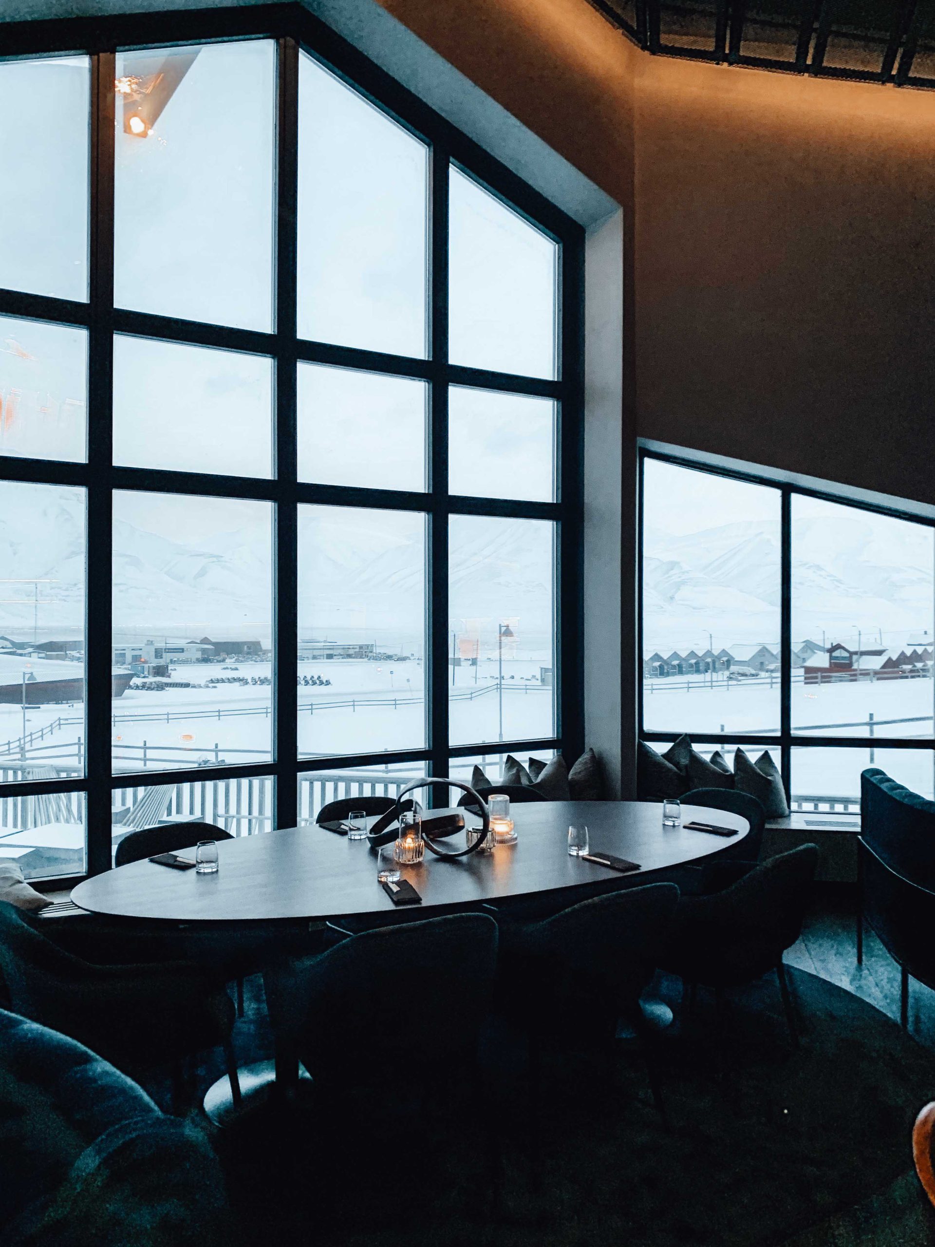
How would you define the ‘Scandinavian way’?
Scandinavian thinking is clear and simple, especially when it comes to using materials. To us, wood is wood, stone is stone. Our designs are inspired by nature and the greatness of it. We try to implement natural materials in a clever and clean-cut way. Of course, we have to factor in functionality, for example, if a client works in hospitality, we cannot always use wood because you need something you can take care of in the longer run.
From your time in the UK, how do you find British design compares to Norwegian?
It’s hard to define exactly what “British design” is. The interesting thing about it is that it’s much more about textures. Some designers in Britain use a lot of carpet and a lot of wallpaper and prints. It’s a kind of “more is better” mentality, while in Norway it’s about “less is more”. Some British designers, however, are not so different from formal Norwegian style – styles you’d find in the fancy, trendy part of Norway.
What do you think if someone compares Scandinavian design to IKEA?
I get very upset! I love IKEA for what it is. Everyone needs IKEA at some point in their life, say you need candle lights or you’re studying and need cheap furniture. But it has nothing to do with quality. What is grounded in Scandinavian design is actually the hand-crafted materials.
What’s the difference between an interior architect, such as yourself, and an interior designer?
The difference is the process. If a designer comes into a room and changes the colour of the cushions and adds some new flowers, it will always be nicer, but they haven’t done anything extra for functionality of the room. Yes, cushions and curtains will always come into the process but, for me, it’s always the last thing I do. We always start by looking from the top down and understanding the purpose of the space. We then try to challenge the space so our clients can get more value from the area. We begin by creating a room plan and looking at how to make it work from an architecture perspective by, for example, adding a wall or taking a wall down, opening up a ceiling or closing a ceiling. The difference between interiors architects and designers is that we’re constantly looking at the architecture and geometry of spaces – and we don’t stop learning. Just as doctors will never be finished with their education, it’s the same with interior architects. We’re always researching and learning new methods of geometry. What I find very inspiring about an interior architect is that it’s not only about making things beautiful, it’s about making things beautiful and functional at the same time. >>
Related: The inspiration behind Ritz-Carlton Berlin's €40m Art Deco renovation
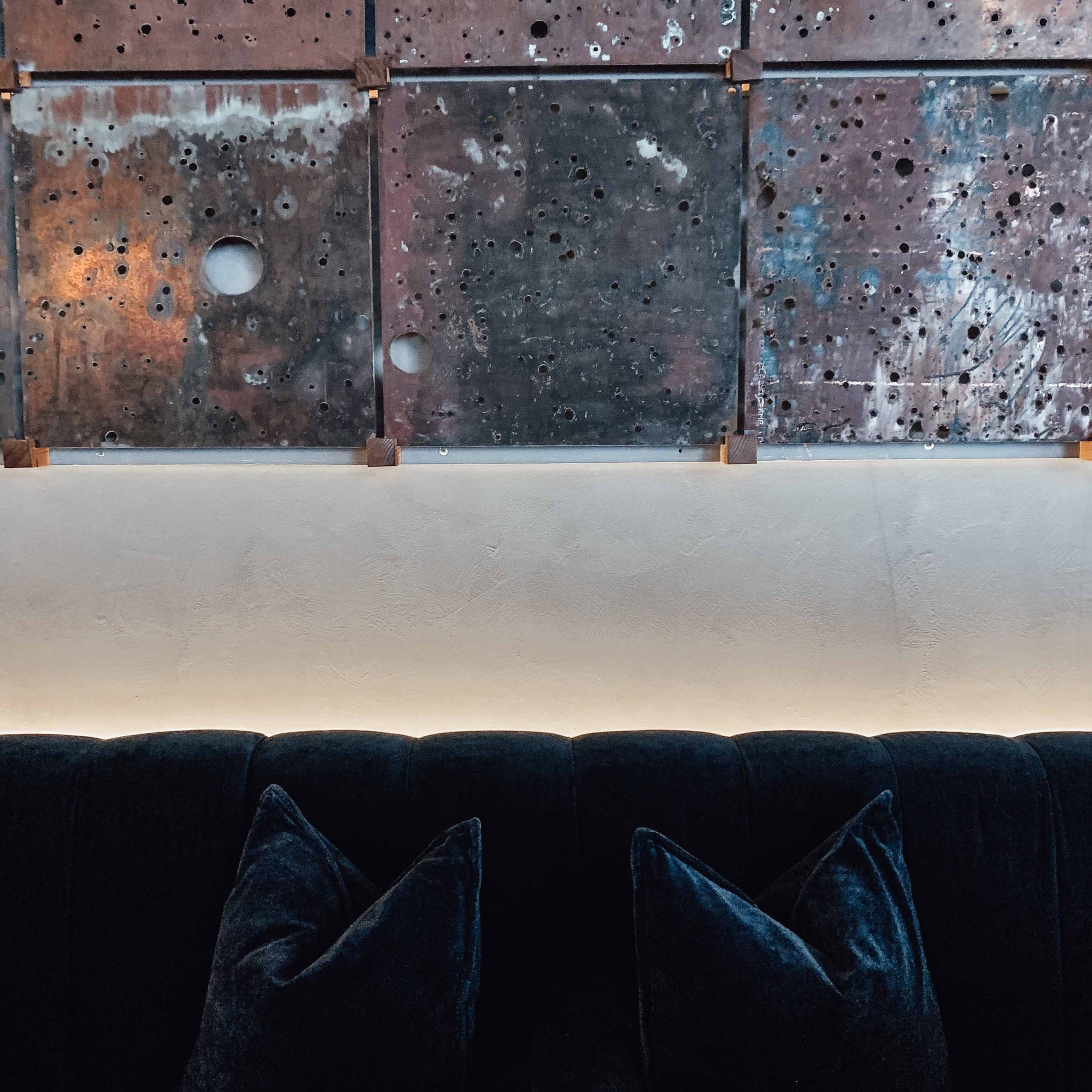
You’ve recently completed the interiors of the new-look Polar Hotel Svalbard. What made this such an interesting challenge project?
The hotel in Svalbard is a very special place. The location, Longyearbyen, is part of Norway but, for me, it feels like a different world. It’s so far away and it’s so close to the Arctic Circle. The big difference is that half of the year it is completely dark, and half of the year is completely light. That in itself makes the design fundamentals very challenging because all of your materials, all of your lights and all of the design in general has got to work in two completely different worlds. For example, velvet on sofas will look completely different when it’s dark compared to when it’s light. Guests waking up in June will have a completely different experience of the whole journey compared to guests waking up in February. It’s a big challenge. You don’t really know how it will work out before it is built.
Talk us through your design process for the hotel.
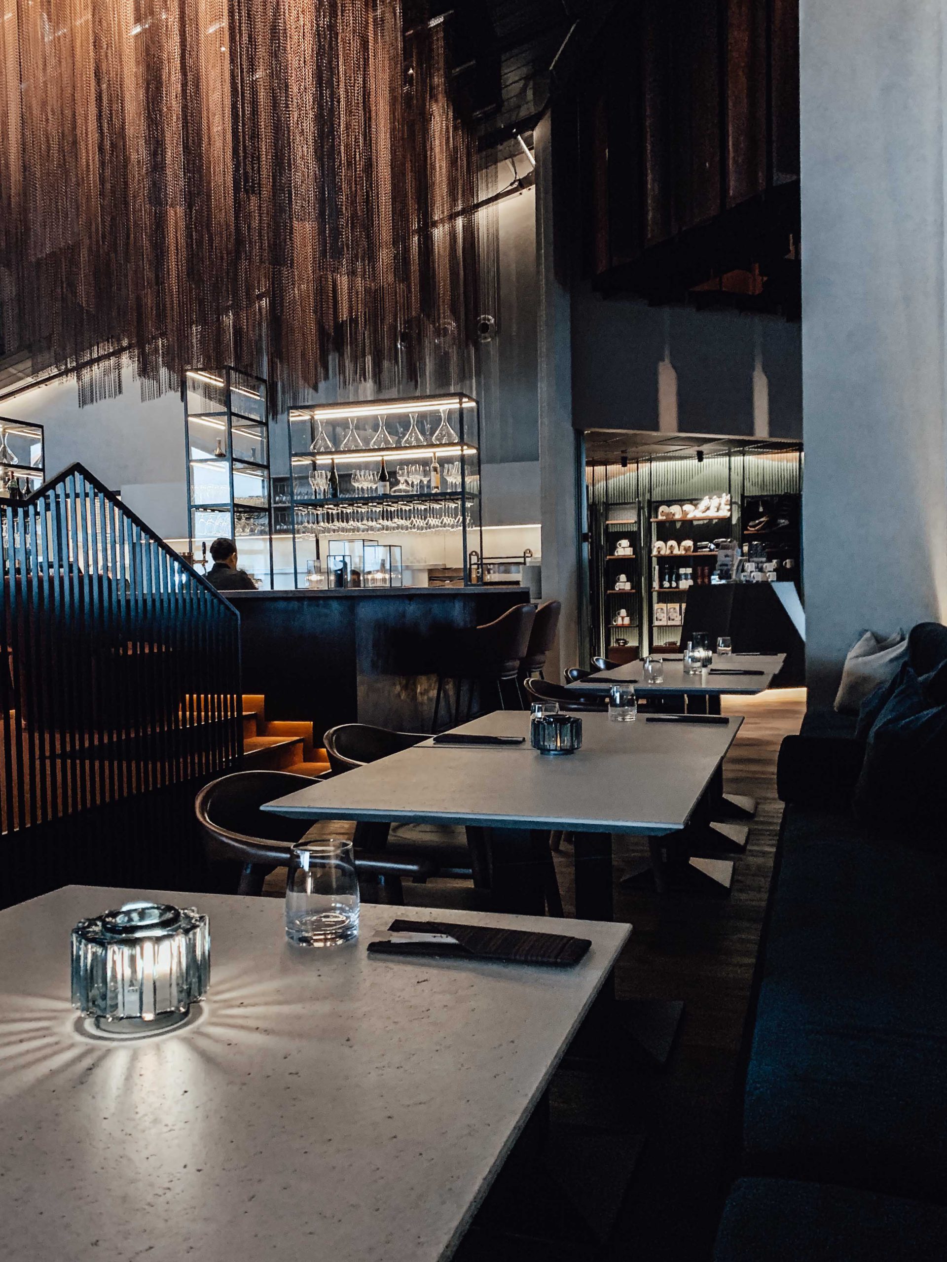
The existing hotel was from 1994 and, as you can imagine, lacked identity. The first thing we wanted to implement was a brand- new identity. It was a big process but the owners were open minded. We started by taking away all the mess and cleaning up the whole space to understand which structures were important to keep and which we could develop. Then, we looked at the colours and materials that reflect the Svalbard community. When you’re landing in Svalbard, the nature is just amazing, and the polar archipelago is very simple, and this is something we wanted to reflect through the design. For example, there is a big natural installation hanging over the bar, which mirrors the polar light – the light and colours up there are always very, very melting into another colour. The island is full of colourful houses, which were a great inspiration for our colour palette. And coal mining is the biggest industry in Svalbard so we factored this into our material choices.
So you designed the hotel with the local environment and community in mind?
Yes. Svalbard is small but it is a very special, friendly place. It was very important for us to make sure that the community felt totally comfortable and that the design wasn’t so grand that they wouldn’t dare to go into the bar and buy a beer. So, it’s very down to earth. At the same time, we challenged the hotel owner to make some great designs, which is always our goal. Target number one is, of course, to make great designs, but to make them functional too.
What’s the next project you’re working on?
At the moment, we are doing a very interesting restaurant concept in Oslo, Norway, called Michael. It’s a good project for us as we’re picking up more hospitality projects in Norway in particular. Going back to my family roots in hospitality feels very natural and exciting. Our bread-and-butter projects are still offices, but there are exciting things happening in high-end residential, hospitality, hotels and restaurants, too.
Read more about Kaape Interiors in Tempus Design Edition, available now


